
Black Sand Creatures is the first project / series I've released as Made Up Lifeforms (which I'm quite proud of!). Here's a brief outline of how I stumbled upon those peculiar beings.
(Just to mention, I'm using Javascript with canvas-sketch toolkit and p5.js.)
Base algorithm
It all began with experimentation. I was (and still am!) just starting my generative art adventure, fascinated by dozens of algorithms immediately. One of them was noise with domain warping (described well by Inigo Quilez), which I stumbled upon quite early.
The base formula for domain warping goes like that:
f(p) = fbm( p + fbm( p + fbm( p )) )Where fbm is any function, and p is any value (2d position vector for 2d visualization). In my case, fbm is a Perlin Noise function.
I've actually implemented the algorytm in a "wrong" way (which I realized later) - adding more parametrization and using two of noise values as a single vector for the third one. That gave quite specific shapes in result.
The formula I've implemented looks like that (pseudo-code):
n1 = noise( V + P1 )
n2 = noise( V * n1 * n1m + P2 )
n  = noise( V * nm + P3 * [n1, n2] )
where: noise() is a Perlin noise functionV is [x, y] position vector P1, P2, P3 are static vectorsn1m, nm are static number values (multipliers)[n1, n2] is a vector of noise valuesn is a "final" noise value
This gives quite a few input parameters to experiment with (static vectors and multipliers), not mentioning two more, really impactful ones - noise seed and noise scale.
One note here. I'm actually calculating those values for each point of the canvas - which increases dramatically for high resolution outputs. This can be optimized, obviously with splitting the area into cells, but it depends on what you need, and I really wanted per-pixel values here (that's probably something I should've implemented in GLSL).
Early experiments and basic coloring
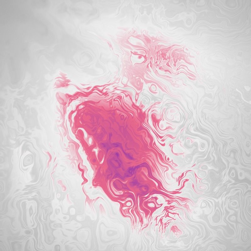
As I've realized, nice and simple way to visualize noise with domain warping is using a static colors palette. And so I did. Palettes I was using were either smooth gradients (4 to 8 colors) or half-splitted (like in examples below).
Value-to-color formula was pretty straightforward here, something like:
const color =
	palette[ floor(map(value, 0, 1, 0, palette.length-1)) ]
I was quite excited with some first results (called them islands).
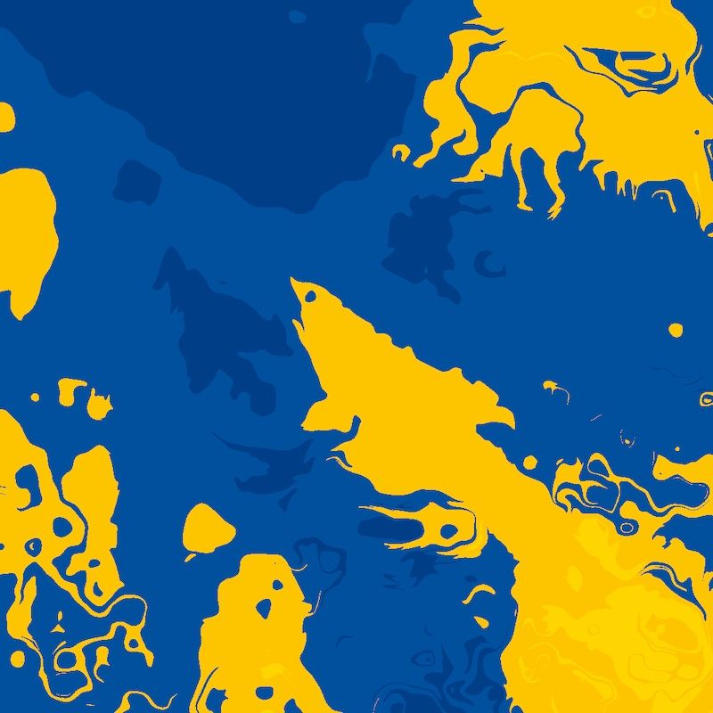
But what I wanted to achieve, instead of "infinite" fields of noise were more isolated shapes, centered on the canvas (maybe the "shark" inspired me).
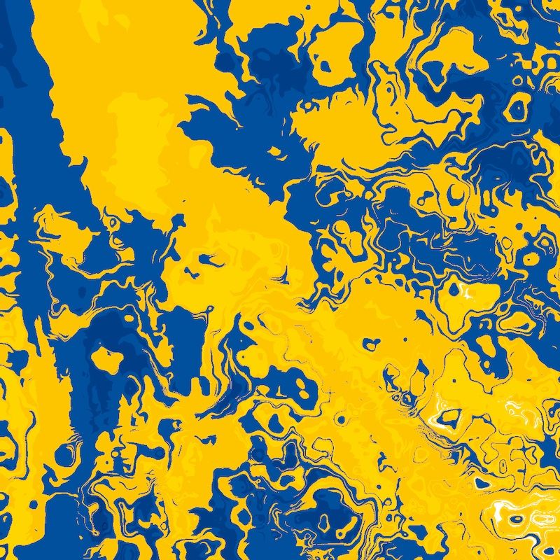
Limiting the shapes and compression
What I did to keep the shapes out of borders was simply masking the results with a circular shape (multiplying noise values by centered circle shape values).
Also, I needed to "compress" the results, mapping them from min..max values to 0..1, so I always get the whole spectrum.
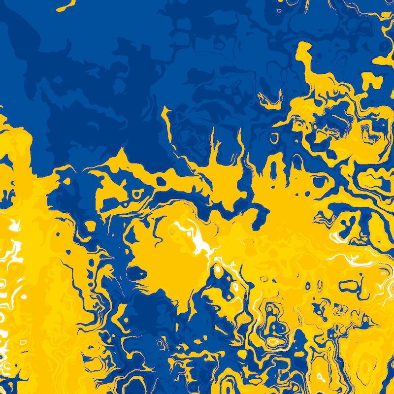
Mixing the colors
Then I looked closely to "islands" and thought, the sharp edges is not really what I want, they look rough (especially on larger sizes) - how can I make them look smoother?
Here's where color mixing stepped in. I've used pretty obvious method for that, which is color interpolation (p5's lerpColor). For each point (value), I've calculated a color as a mix of two neighboring (palette-wise) colors. Another results, another awe!
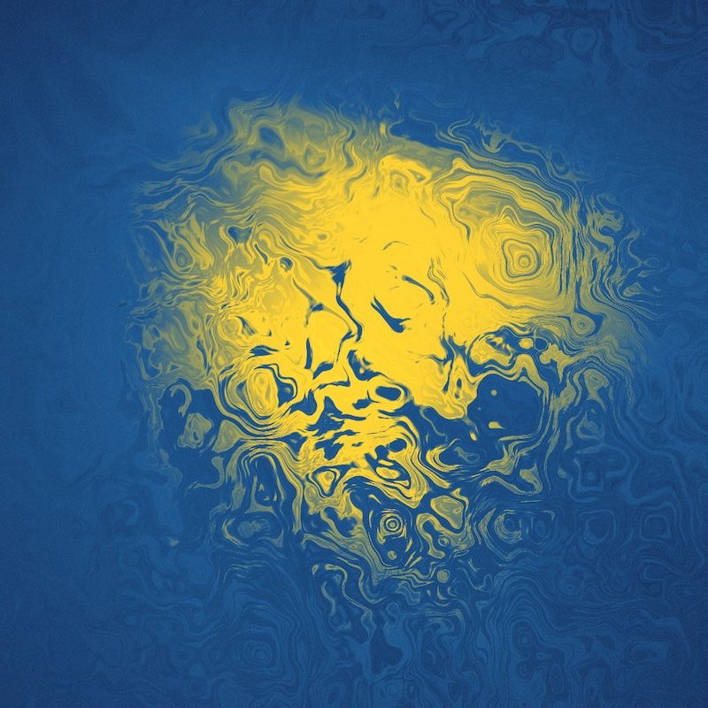
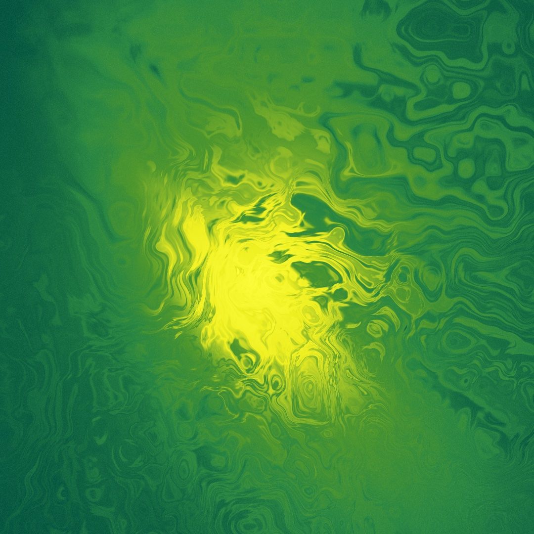
I've called those ones Floaty Creatures (which is another nice-looking family, that I may revisit in the future).
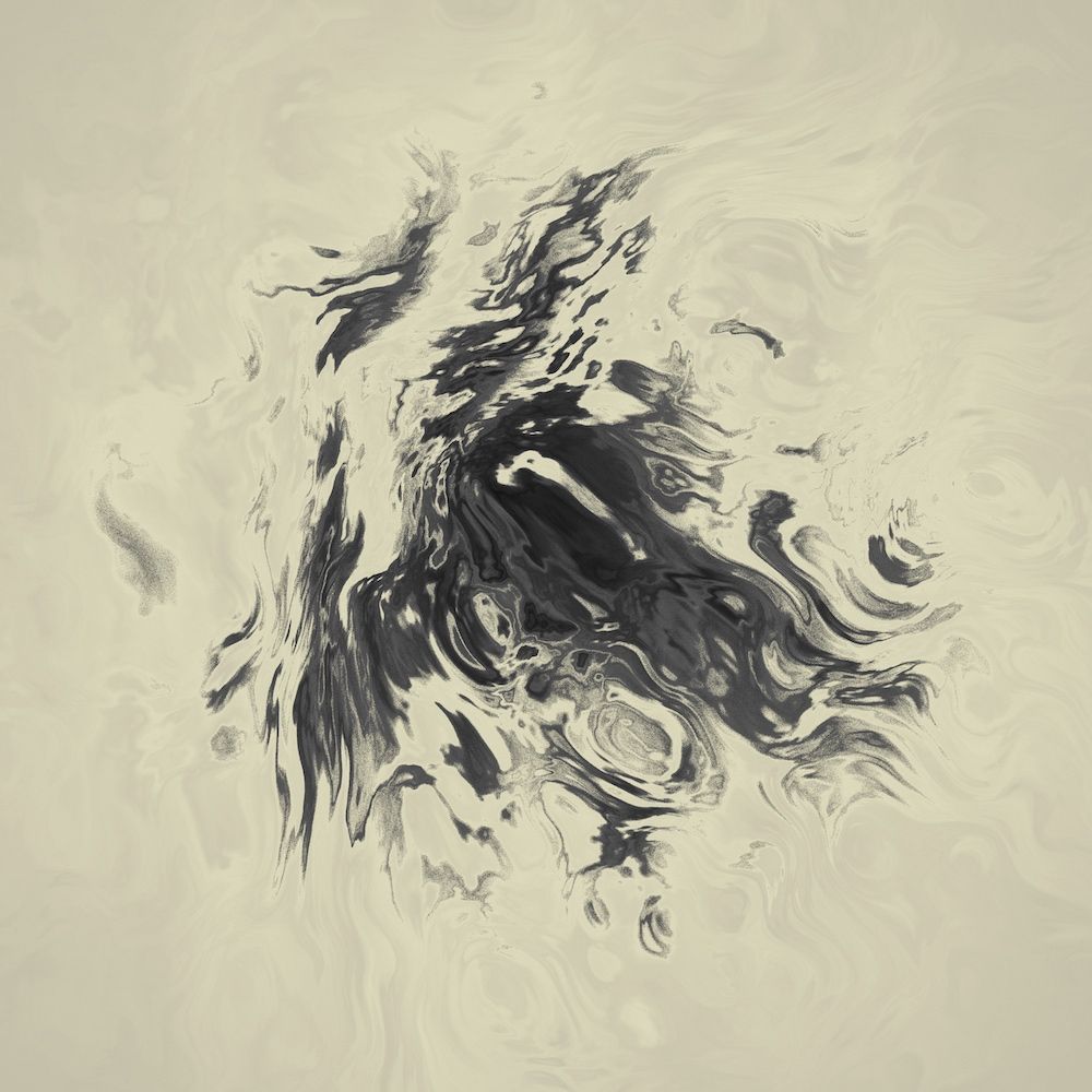
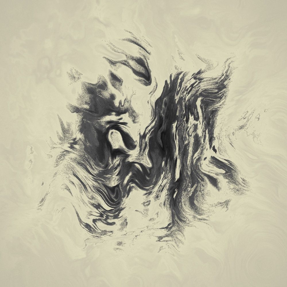
The "sand"
The mood I found satisfying came with changing color interpolation to granular gradients. Instead of finding interpolated color for each pixel, I choose one of two colors, using the value on that pixel as a chance for it to have one color or another.
// value mapped to palette size
const nn = map(n, 0, 1, 0, palette.length - 1);
const c1 = palette[ floor(nn) ]);
const c2 = palette[ ceil(nn) ];

// nn%1 gives 0..1, random() gives 0..1 too
const color = random() > nn%1 ? color1 : color2;
It started to look like a sand already. One final touch was finding the right palette with black-ish and beige gradients.
(Another note here - such coloring method makes it look smoother for higher resolution images. But shapes are still the same, so I consider it an advantage. For a regular size, I've used 3000 x 3000 px)
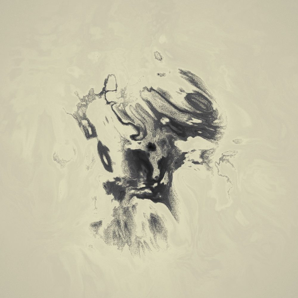
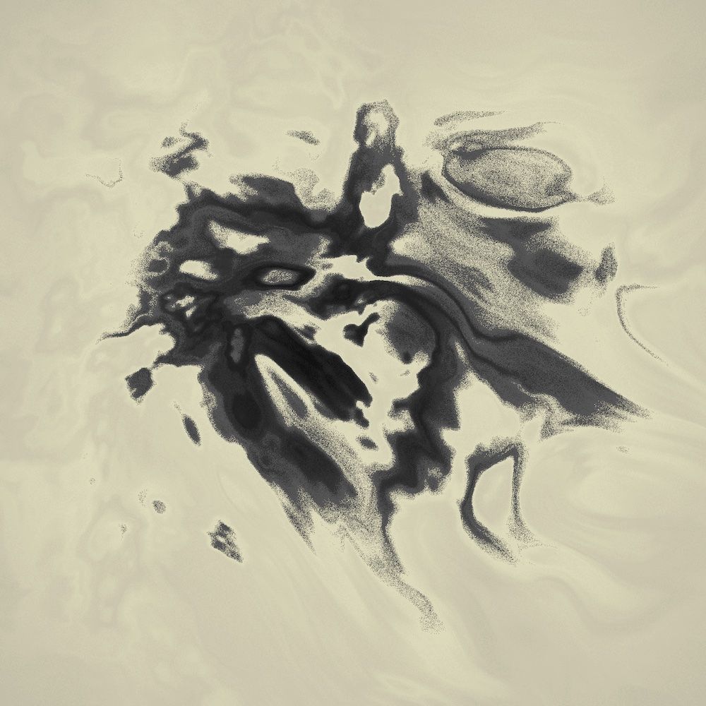
Below are the first three satisfying results I've received (found with trial-and-error input parameters) - two of them are part of the final collection (#00 and #18).
Selection process
I've decided the final collection will consist of 20 works. Choosing them was a fun experience and quite lot of work at the same time!
For about a week I've generated hundreds of images (about 800, I think). Some of them were really bad or boring, some looked really well but haven't looked like any kind of living creature. What I was looking for were the ones that really stand out, inspire me in some way, look unique in the collection, yet I can see some kind of being quite easily.
Some general criteria I've been following (besides what I mentioned above) were:
- Does it look good in a small size? (general shape)
- Does it look good in a large size? (details)
- How does it look when I rotate it 90/180/270 degrees
- Would I hang it on my wall?
- Does it match the mood of the collection?
The more I've been generating and looking through, the more I was rejecting. But hey, 20 is not 2000, so after a few days, I've finally considered the list complete.
You can see all of the images here. Also, in the moment of writing this, they're all available on Opensea (with high quality, 5k version included).
Thank you for reading!
For more of my work, you may follow Made Up Lifeforms on Instagram or subscribe here.